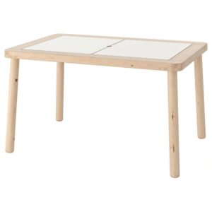
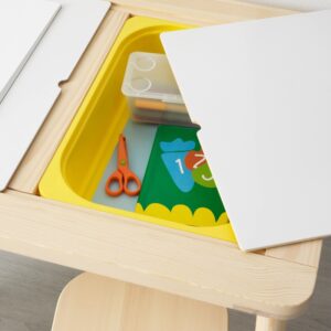
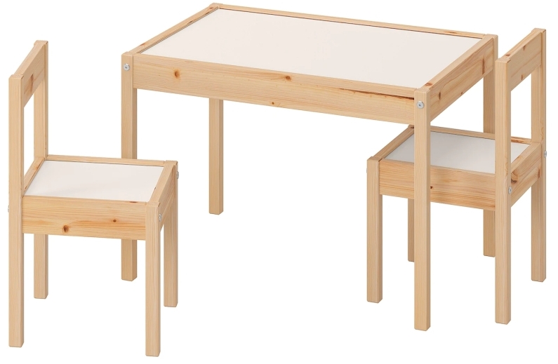
The Client's idea for this table had originally come from the 'Flisat' children's table they had seen at Ikea, pictured above. The table offered some interesting features and its appeal was easily understood with its melamine writable top and integrated storage bins.
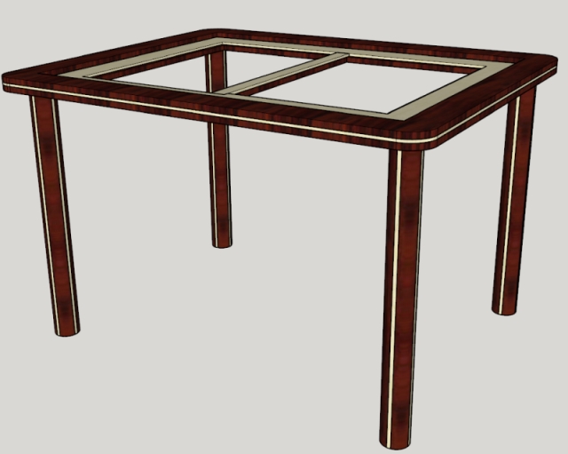
The client was less enthused with the square wood stools that came with the Flisat's Table. They felt the chairs that came with the Laett Children's table (shown left) would suit their project much better.
Because the table would ultimately be used by their preschooler, the client wanted to use a wood species that was much more durable than the lowgrade pine the Ikea tables were constructed from. Aside from being highly durable, they also wanted to use wood(s) that were aesthetically pleasing and fit well within their current decor.
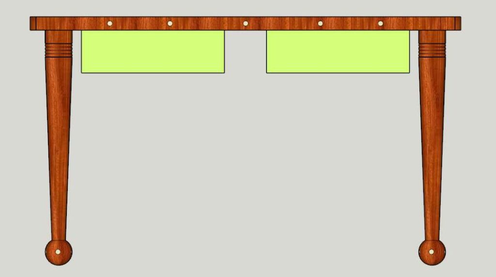
Shown on the left is an example of an early design that featured a dark wood for the primary structure with a lighter wood used for accent. While the client liked the two-toned aspect of the design, additional work was still required on the details.
While discussing these refinements the client also chose Jatoba wood for the main structure of the table. Jatoba is an exotic wood sourced primarily from South America and is also known as Brazilan Cherry, despite having no relation to Cherry wood. In addition to having a wonderful red tone and clear grain, it is the third hardest wood in the world- almost three times the hardness of Oak!
Maple, a very hard domestic wood, was chosen for the lighter accents.
Among other design details, the shape of the legs was improved and the linear accents were made circular; as shown in the drawing below.
The prototypes in the following picture were created to help the client better visualize how this design would ultimately look using the chosen materials.
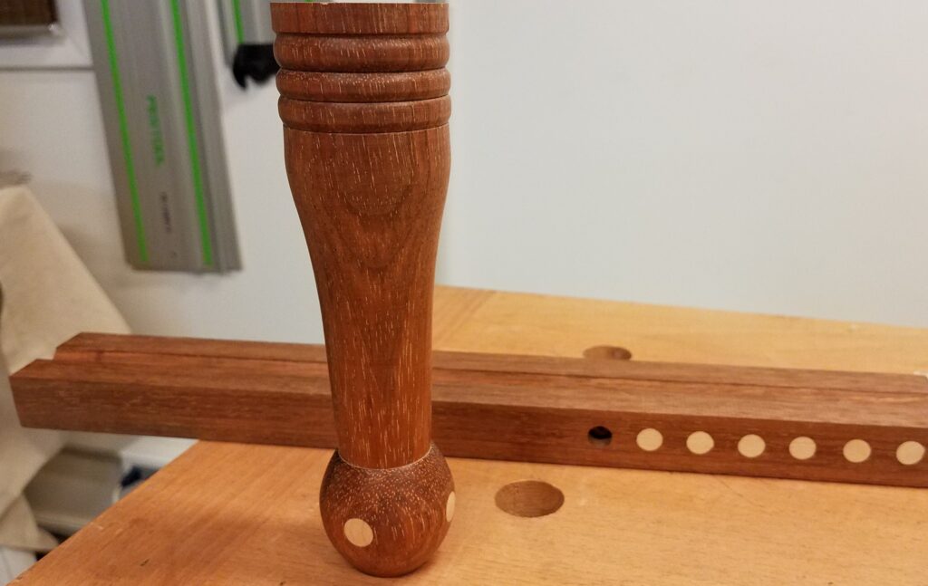
While this is an optional step, it can be performed on high-end projects when needed to verify critical design elements and/or expensive material selections.
Initially, we considered using marquetry to add his daughter's name to the top of the table as shown below.
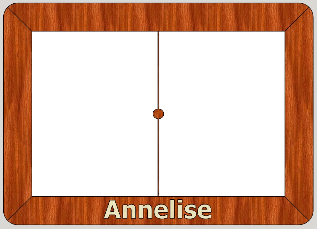
While this looked nice in the CAD design, the actual lettering on the sample using the Jatoba and Maple lacked the feminine quality the customer desired.
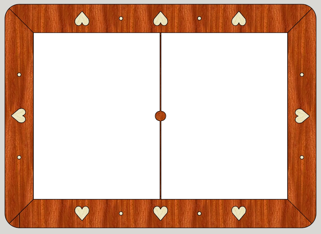
With this understanding in mind, I suggested the heart design, shown below, that also continued the circular theme in use on the legs and table edge.
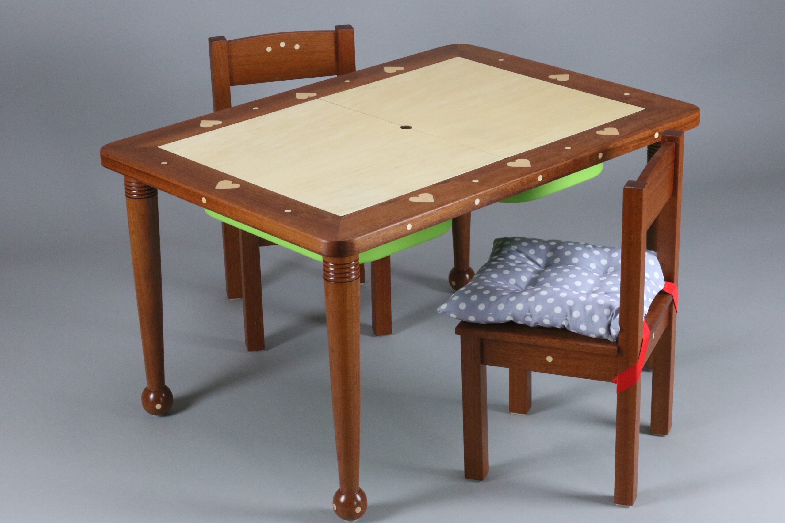
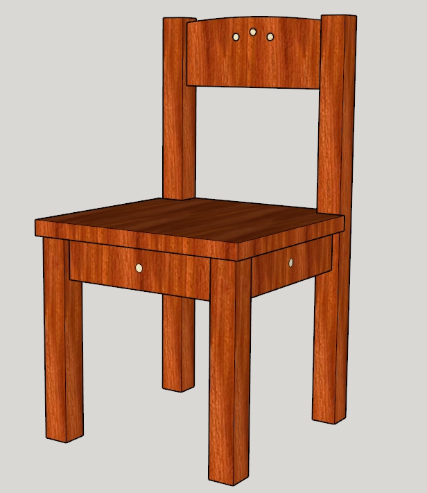
The clients were extremely satisfied with this design version of the table itself and it was time to consider the matching chairs.
The design of the chairs flowed naturally from the table and is shown below. From this point, detailed drawings were created that showed every detail of both the table and chairs, including sizes and all dimensions.
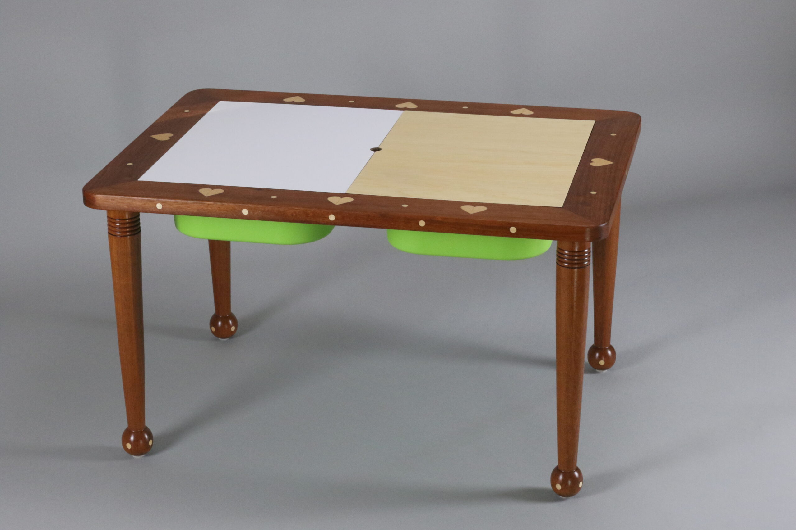
After the initial completion of the project, the client suggested making the opposite side of the removable melamine top panels on the tabletop Maple to help balance out the overall color scheme. This idea was ultimately adopted and can be seen in the final pictures of the table shown below.